Building a notepad for my Kobo's experimental browser
/ 6 min read
My Kobo Libra Color is a lovely device for reading. It also has a feature most people never touch: a hidden, half-finished “experimental” web browser. I kept thinking about that grayscale-friendly, glare-free, gloriously distraction-free screen and wondering — could I write on this thing?
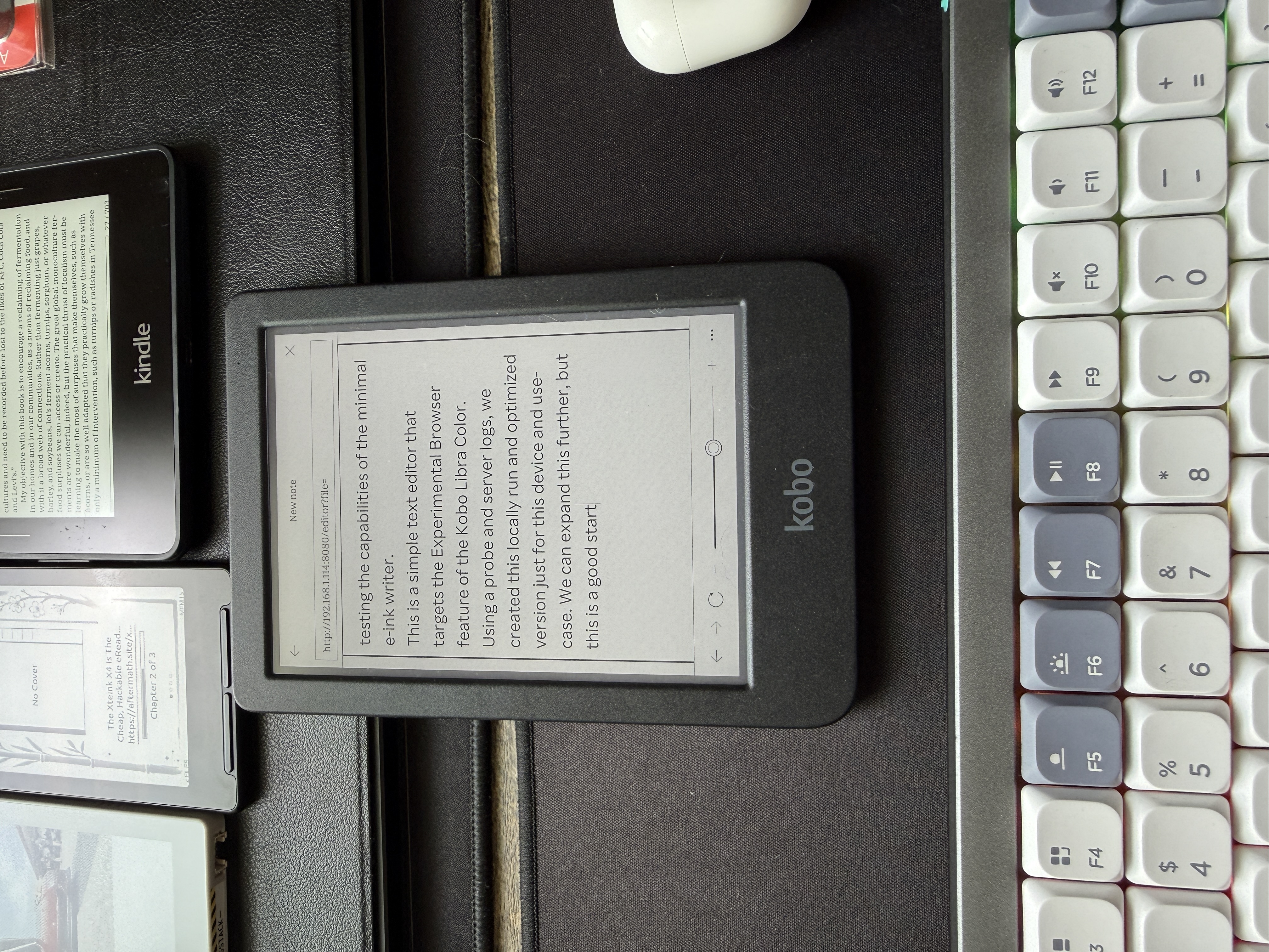
Not in some heavyweight app. Just a clean little text editor I could open in the browser, type into, and save. So I built one. The interesting part wasn’t the editor — it was letting the device dictate the design instead of guessing.
The problem with building for a mystery browser
E-reader browsers are a black box. They’re usually some frozen, years-old fork of WebKit, and “supports JavaScript” can mean anything from mostly fine to here be dragons. If you build first and test later, you burn a weekend discovering that the framework you reached for doesn’t run.
So I did the opposite. Before writing the editor, I wrote a 30-line diagnostic server and a single probe page whose only job was to interrogate the browser: run a battery of feature tests, show the results on the device, and quietly report them back to my laptop.
I loaded it on the Kobo. Here’s what came back:
| Capability | Result |
|---|---|
fetch / XMLHttpRequest | ❌ both missing |
localStorage | ✅ works |
contentEditable + execCommand | ✅ works |
| Flexbox / CSS Grid | ❌ unsupported |
| Engine | AppleWebKit 538.1 (~2014) |
| Viewport | 732 × 762 CSS px, color e-ink |
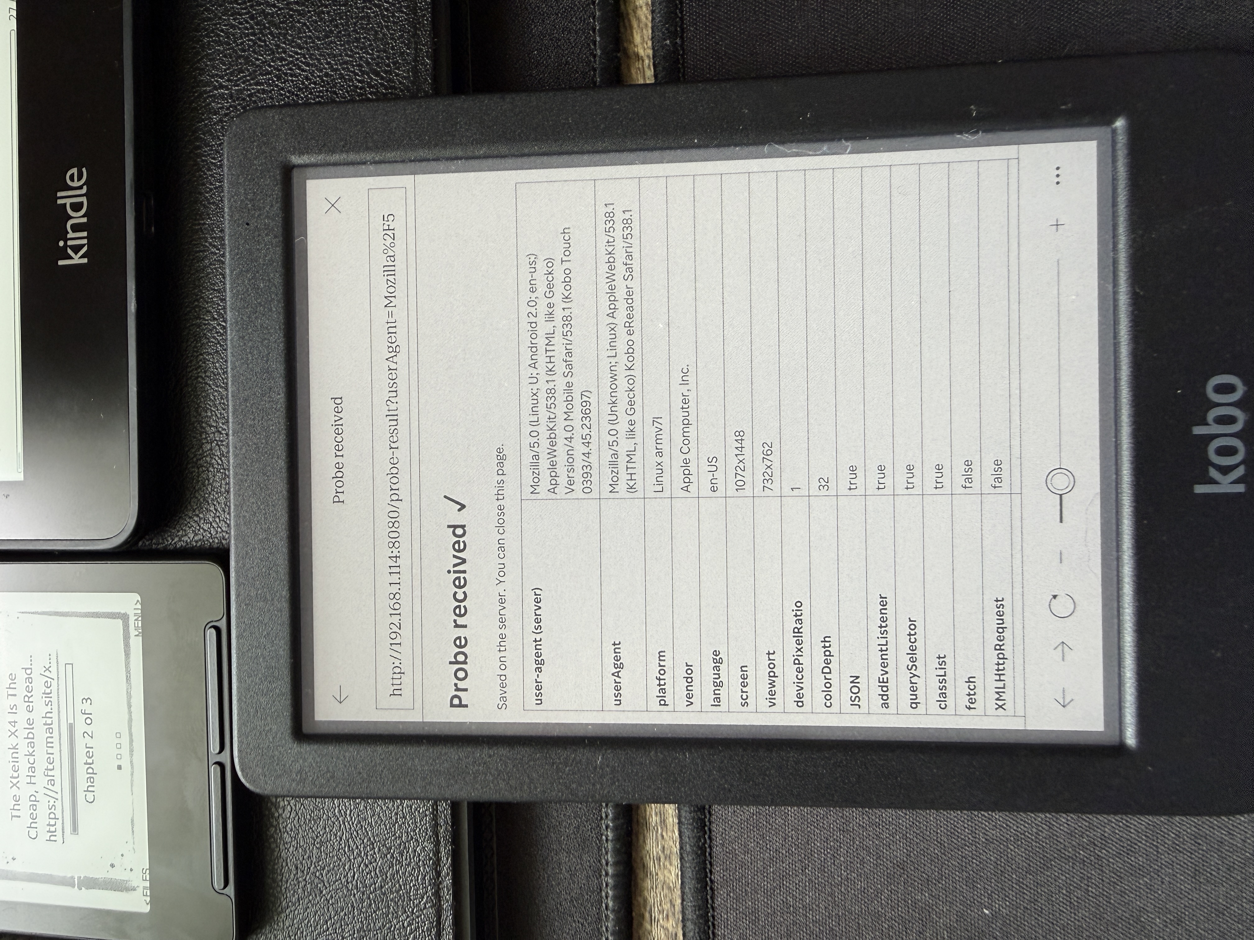
That table is the architecture. I didn’t have to debate it.
What the constraints decided for me
No fetch, no XMLHttpRequest. This is the big one. There is no AJAX on this device — full stop. So every action that touches storage had to be a plain old HTML <form> submission with a full page reload. No single-page-app, no background saves. At first this felt like a limitation. Then I realized it’s actually perfect for e-ink: the screen does a full refresh on every interaction anyway, so a page reload is free. The web’s oldest pattern turned out to be the most modern choice for this hardware.
No flexbox, no grid. Layout went back to inline-block and tables. Honestly fine for an interface this simple.
localStorage works. I didn’t want to depend on it for saving — files live on a tiny Node server on my laptop, written to a folder — but I used it as a quiet safety net. The textarea backs itself up every few seconds, so a stray tap or a dead battery doesn’t cost you your paragraph.
contentEditable works — which means rich text was possible. But I chose plain .txt anyway. On a reflective e-ink panel, plain text is calm, fast, and survives forever. “Formatting” became a set of typed conventions (headings underlined with ===, [ ] checkboxes, #tags) documented right inside the app.
The whole thing is zero dependencies — just Node’s built-in http module. Nothing to install, nothing to break.
Making it actually pleasant
A blank textarea is a tool. To make it something you’d reach for, I added two things.
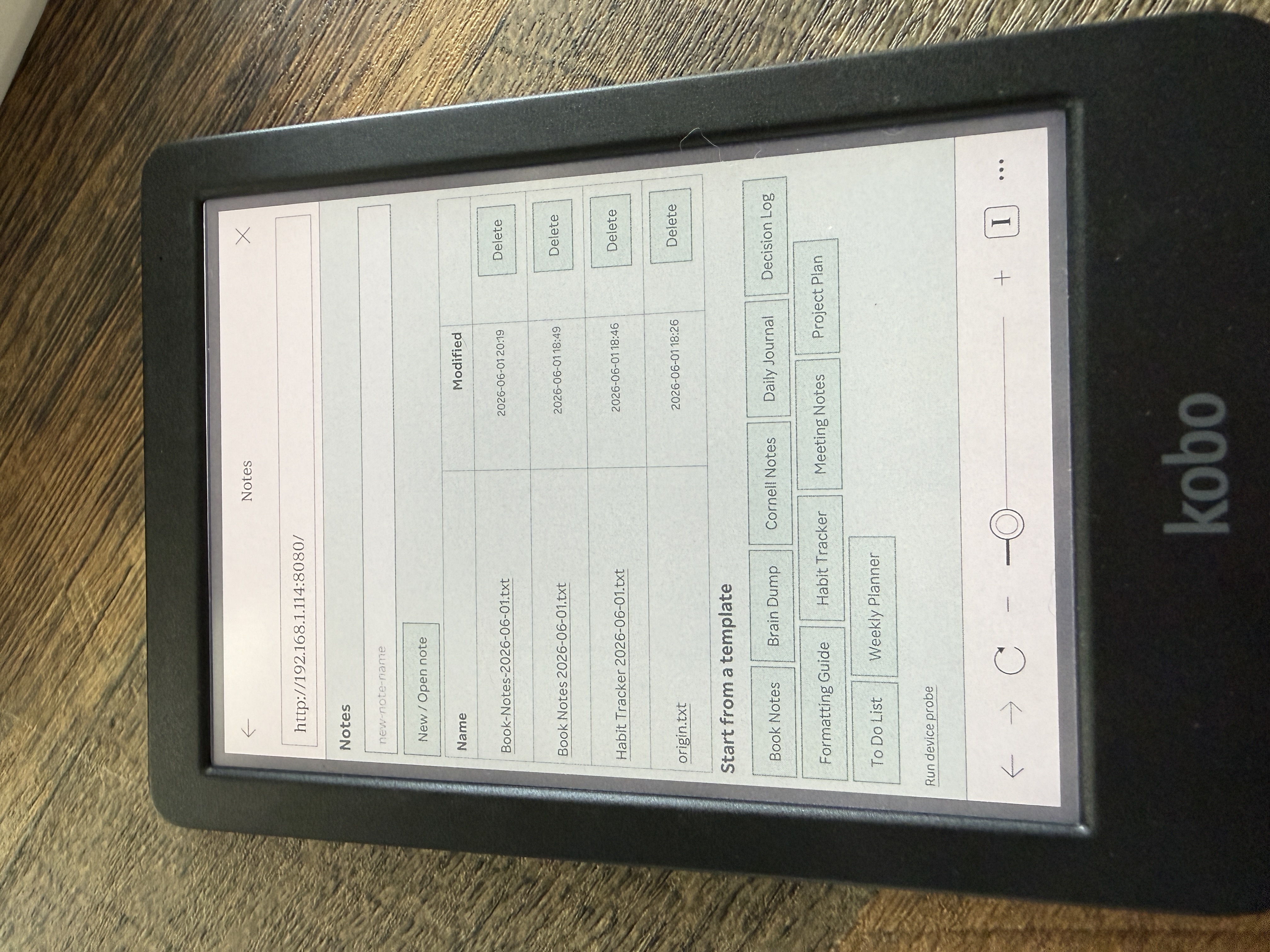
Templates. A templates/ folder of plain-text scaffolds — Daily Journal, Meeting Notes, Book Notes (a natural fit for an e-reader), a Decision Log, a Weekly Planner, and more. Tap one and it opens pre-filled with a date-stamped filename, so saving always creates a new note and never clobbers the template. Drop your own .txt into the folder and it shows up automatically.
Themes. The Libra Color has a color screen, so I built a theme dropdown — Paper, Sepia, Night, plus tinted Mint/Sky/Rose — and let you layer on subtle background textures (ruled, grid, dots). The textures are pure CSS gradients, not images: vector-crisp on e-ink and nothing to download. Because the browser predates CSS custom properties, each theme is just explicit CSS, generated in a loop on the server.
The bug that taught me how e-ink renders
Then something broke. After I added themes and templates, the buttons on the editor page stopped rendering on the Kobo — but only on the editor, and only on the device. They were fine in a desktop browser.
The clue that cracked it: zooming all the way in made the buttons appear. That’s not a layout bug; that’s a repaint bug. The buttons existed and were styled — they just weren’t being painted until something forced a reflow.
The culprit was my theme switcher. It applied the saved theme by changing a class on <body> after the page loaded. On modern browsers that’s invisible. On this 2014 WebKit, that post-load restyle quietly dropped the form buttons from the paint pass until a zoom forced them back.
The fix was to stop mutating the page after load: apply the theme class to <html> from a tiny script in the <head>, before the body ever paints. No post-load restyle, no dropped buttons — and as a bonus, no more theme “flash” on every page load.
There was a second, simpler gremlin too. The templates had introduced filenames with spaces, which meant URLs with %20 — and this browser mishandled the escaping. The defensive fix was easy: never let a space into a filename. Spaces become hyphens on save, while the UI still displays them as friendly spaces.
What I’d tell anyone building for weird hardware
- Probe before you build. An afternoon spent measuring the device’s real capabilities saved me from days of wrong assumptions. The feature table wrote the spec.
- Embrace the oldest patterns. Form-POST-and-reload is unfashionable on the modern web and exactly right for e-ink. Constraints aren’t always compromises.
- Bugs are documentation. That unpainted-button hunt taught me more about how e-ink actually renders than any spec could have.
The result is a quiet, glare-free place to write, running on a device I already owned, built entirely from what that device told me it could do. Sometimes the best thing a browser can give you is an honest answer about its own limits.
Built with a lot of help from a coding agent that did the probing, the bug-hunting, and most of the typing — while I made the calls on what to build.